Bar diagrams, also known as bar charts or bar graphs, are a commonly used data visualization tool for displaying categorical data. They have their own set of advantages and disadvantages, which make them suitable for certain types of data and less appropriate for others.
Here are some advantages and disadvantages of using bar diagrams:
Advantages:
Easy to Understand: Bar diagrams are simple and straightforward, making them easy for a wide range of audiences to understand, including those with little to no statistical or mathematical background.
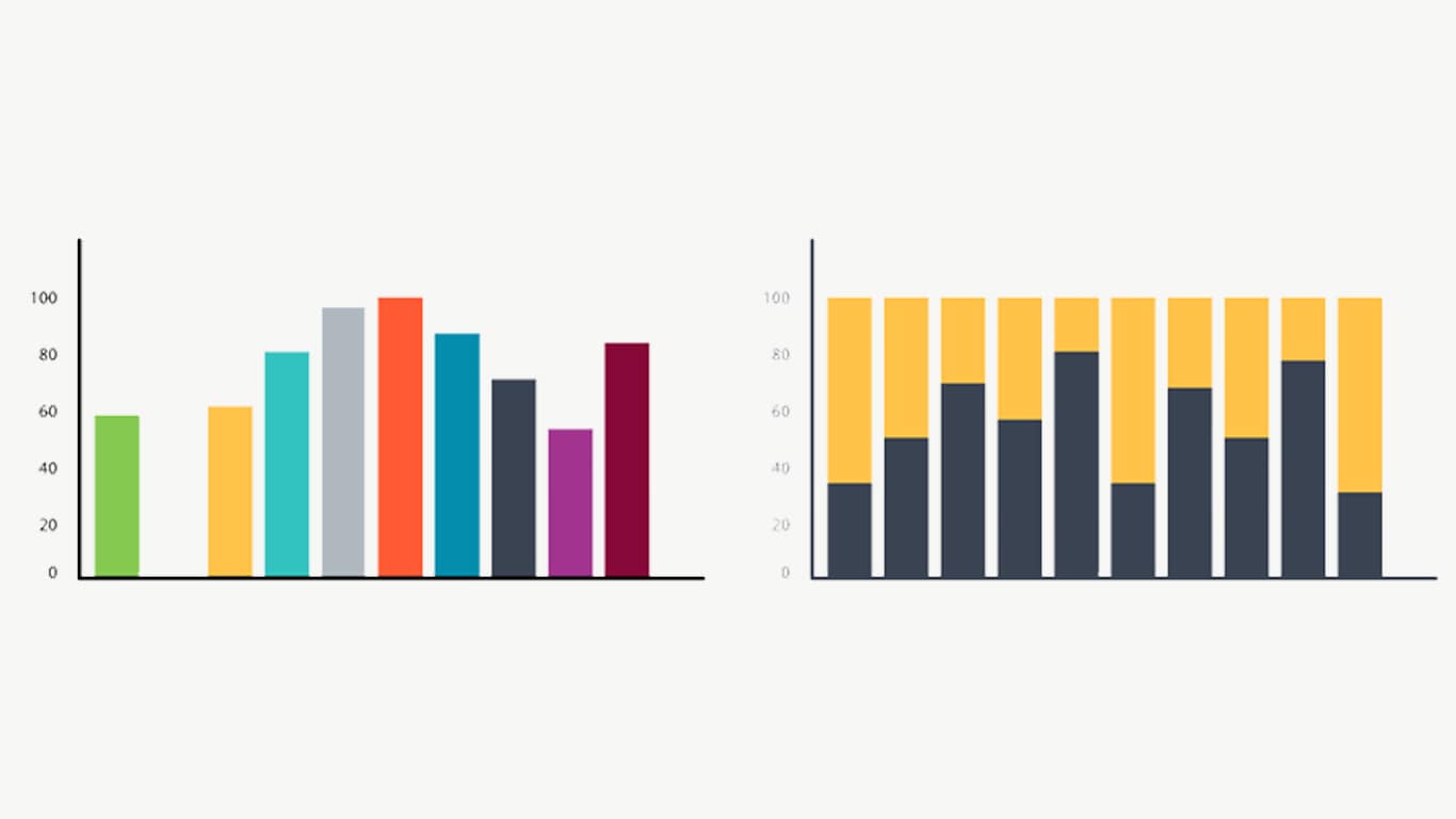
Effective for Comparisons: Bar charts are excellent for comparing data across different categories or groups. The length of each bar visually represents the quantity or value being compared, making it easy to identify trends and differences.
Categorical Data Representation: Bar charts are particularly useful for displaying categorical or discrete data, such as the number of items in different categories, survey responses, or types of products.
Visual Impact: The visual representation of data in bar charts can be impactful, helping to emphasize key points or trends in the data, especially when using color and labels effectively.
Flexibility: Bar diagrams can be horizontal (horizontal bar charts) or vertical (vertical bar charts), allowing flexibility in presentation to suit the data and the audience's preferences.
Compatibility with Software: Most data visualization software tools, such as Excel, Google Sheets, and various data visualization libraries in programming languages like Python, R, and JavaScript, support creating bar charts.
Disadvantages:
Limited for Continuous Data: Bar charts are not suitable for representing continuous data with many unique values or a wide range of values. They work best with discrete or categorical data.
Misleading Scaling: If the scale on the vertical axis is not appropriately chosen, it can be used to exaggerate or downplay differences between bars, potentially leading to misinterpretation of the data.
Inefficient for Large Data Sets: When dealing with a large number of categories or data points, bar charts can become cluttered and difficult to interpret. In such cases, alternative visualizations like histograms or heatmaps might be more suitable.
Less Precision: Bar charts provide a visual representation but may not convey precise numerical values as effectively as tables or line charts. This can make it challenging to extract exact data points from the graph.
Not Suitable for Time-Series Data: While bar charts can be used to show trends over time, they are not as effective as line charts for displaying continuous time-series data, where the sequence of events is essential.
Limited to One Variable: Bar charts typically represent one variable at a time. If you need to visualize relationships between multiple variables, other types of graphs (e.g., scatterplots or bubble charts) may be more appropriate.
In conclusion, bar diagrams are a valuable tool for displaying categorical data and making comparisons between categories. However, their suitability depends on the nature of the data and the specific communication goals. It's essential to choose the right type of chart or graph that best conveys the information you want to present.
Thank You