Multiple bar diagrams and divided bar diagrams are both types of bar charts used to represent data visually, but they are designed for different purposes and display data in distinct ways.
Here are the key differences between the two:
Purpose:
Multiple Bar Diagram:
Divided Bar Diagram:
Data Representation:
Multiple Bar Diagram:
Divided Bar Diagram:
Examples:
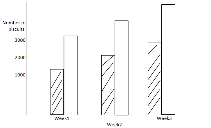
Multiple Bar Diagram:
Divided Bar Diagram:
In summary, multiple bar diagrams are used for comparing multiple data series within the same category, while divided bar diagrams are used to illustrate the composition or division of a whole into its parts. The choice between the two types of charts depends on the specific data you want to visualize and the insights you want to convey.
Thank You