Mobile E-Commerce Differ from Desktop E-Commerce
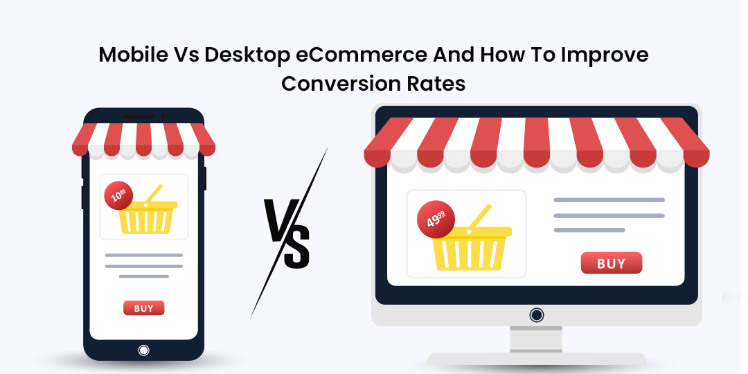
Mobile e-commerce (m-commerce) and desktop e-commerce have several differences in terms of user behavior, interface design, functionality, and optimization. Here are some key differences between the two:
Screen Size and Layout: The most obvious difference between mobile and desktop e-commerce is screen size. Mobile devices have smaller screens compared to desktop computers, requiring a different layout and design approach. Mobile interfaces often use responsive design techniques to adapt to various screen sizes and orientations, whereas desktop interfaces may feature more expansive layouts and multiple columns.
User Interaction: Mobile devices rely primarily on touchscreens for user interaction, whereas desktop computers use keyboards and mice. This difference in input methods influences how users navigate and interact with e-commerce websites. Mobile interfaces often prioritize gestures, swiping, and tapping for navigation, while desktop interfaces may incorporate hover effects, keyboard shortcuts, and mouse-driven interactions.
Navigation and Menus: Due to limited screen space on mobile devices, navigation menus are typically condensed and simplified in mobile e-commerce interfaces. Mobile menus often use collapsible or slide-out navigation panels, hamburger menus, or tabbed interfaces to organize content and make it easily accessible without cluttering the screen. Desktop interfaces may feature traditional dropdown menus, mega-menus, or navigation bars with multiple levels of hierarchy.
Page Load Times: Mobile devices often have slower internet connections and less processing power compared to desktop computers, leading to differences in page load times. Mobile e-commerce websites must prioritize performance optimization techniques, such as minimizing image sizes, leveraging browser caching, and reducing the number of HTTP requests, to ensure fast loading times and smooth user experiences on mobile devices.
Content Prioritization: Given the limited screen space on mobile devices, content prioritization becomes crucial in mobile e-commerce design. Mobile interfaces may prioritize essential content, such as product images, descriptions, and call-to-action buttons, above the fold to capture users' attention quickly. Desktop interfaces, with larger screens, can afford to display more content above the fold and may include additional elements such as promotional banners, navigation links, and product recommendations.
Payment Methods: Mobile e-commerce platforms often offer a variety of payment methods optimized for mobile devices, such as digital wallets (e.g., Apple Pay, Google Pay), one-click checkout options, and mobile carrier billing. Desktop e-commerce platforms may offer a broader range of payment methods, including credit/debit cards, bank transfers, and PayPal, catering to users' preferences and geographic locations.
Location-Based Services: Mobile devices offer location-based services, such as GPS tracking and geolocation, which can enhance the mobile e-commerce experience. Mobile e-commerce platforms may leverage location data to provide personalized recommendations, offer local promotions, or provide location-based search results. Desktop e-commerce platforms typically do not have access to this level of location-based information.
Overall, while both mobile and desktop e-commerce share common goals of facilitating online transactions and providing a seamless shopping experience, they differ in terms of user interface, interaction patterns, performance optimization, and feature prioritization to accommodate the unique characteristics and constraints of each platform. Successful e-commerce businesses tailor their strategies and user experiences to meet the needs and preferences of both mobile and desktop users.
Thank you,